Yesterday, Warcradle posted up some new renders on their official Facebook page of the Ningjing battleship design they have been working on for Dystopian Wars (DW). The changes to the design are both dramatic and subtle; clearly a lot of work has gone into it since we first saw the design back in early December 2017. Given how much the model has changed, I felt compelled to take a detailed look and see what those differences are!
Overview
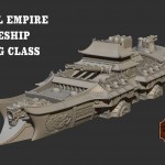
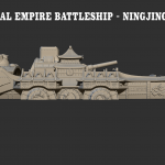
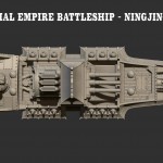
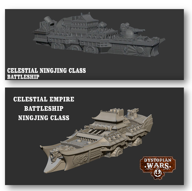
Warcradle has posted 4 views of the new design from different angles, giving us all a good feel for how it’s laid out. In fact, we have a much better feel for this revised design than we did for the first iteration, since as far as I know we only ever saw the one view of that first design. Anyway, here are the pictures of the new design in case you have not seen them yet (click for full version):
Comparison
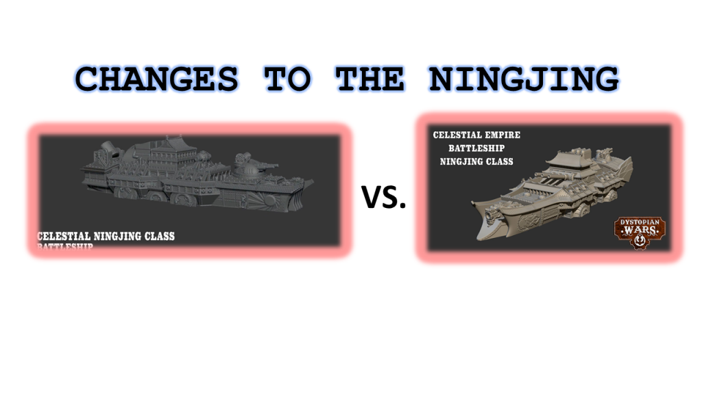
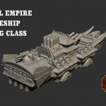
Based on the views that we have been given, I think these two views give us the best direct comparison:
The overall impression is very similar, though even a cursory inspection will reveal that the new design is significantly different. Let’s take a closer look, from bow to stern!
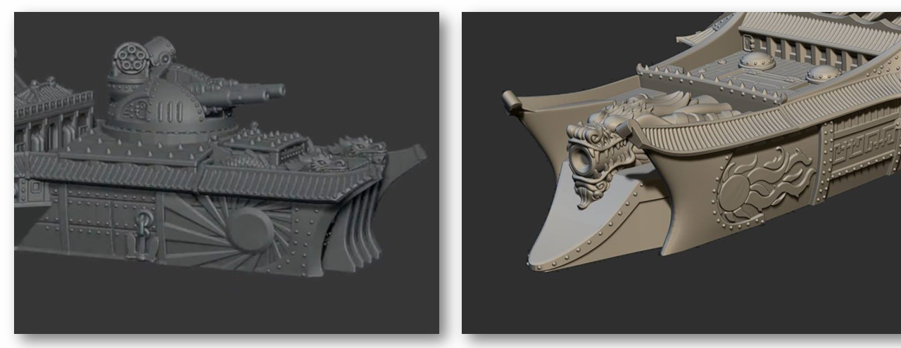
Bow
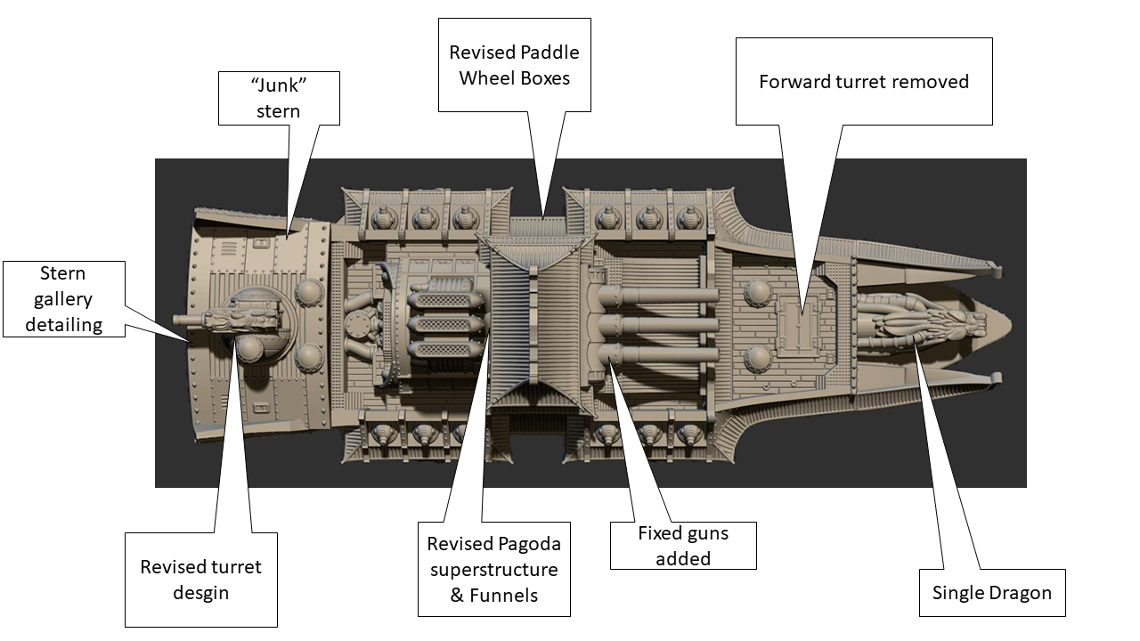
So, the first thing I noticed is that the bow of the ship is much more rounded and contoured than the first version. The two dragon’s heads from that version are now combined into a single, larger head. The forward turret (lifted from the Blazing Sun Kaiju heavy battleship)has been removed, though there is a large deck hatch in that spot that might be a hard point for something else to attach. The Blazing Sun logo on the flanks has been softened and modified into something more resembling a comet. This might be the new symbol for the Celestial Empire as a whole in the DA, it might be the new symbol for just the Chinese portion of that faction, or it might now just be a neat design with no other significance. I’m going to assume it’s the new symbol for the Chinese contingent of the Celestial Empire until I hear otherwise. The anchor on the first version is now gone, which I admit I am a little bummed out about; that was going to be the first anchor ever seen on a DW ship!
Amidships
This area probably saw the fewest changes between the versions; there are still three paddle wheel boxes, a pagoda superstructure, and three funnels. However, there are still some significant differences. The most obvious one is that the generator hard point appears to be gone, replaced by a large triple gun mount. This mount looks to be fixed in train (ie, unable to pivot left or right) as opposed to a true turret. The pagoda has been modified, now having a much less blocky shape. The addition of the Ying-Yang to the side is a nice touch! The galleries above the paddle boxes and the boxes themselves have been tweaked; a few less guns in the galleries, and the shapes of the boxes given some depth. The three funnels (smokestacks) aft of the pagoda are also now much less blocky and squared off. Instead, they now seem to have a racetrack-like cross section, and are taller compared to the pagoda.
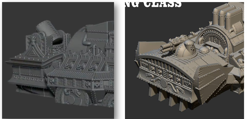
Aft
Like the bow area, the aft has seen a lot of major changes. The most obvious ones are the addition of the “wings” on either side and the addition of a large turret (of a new design) to the aft deck. The wings are intended to invoke classic Chinese shipbuilding designs, generally referred to as “junks,” and here, they almost look like added armor protection. The stern gallery detail looks quite nice, as does the revised shape of the aft deck. There do seem to be fewer pointy bits on the top surface, which lessens the visual call-back to Korean turtle ships. It’s possible the stern gallery detail was present on the first version of the model, though we were never shown that angle so I can’t say for certain either way. The rounded aft end of the central superstructure (seen directly below the funnels) is very reminiscent of Blazing Sun ships like the Kaiju.
Summary
This overview shows all the major changes I’ve noticed, as discussed above:
Final Thoughts
Overall, I think the revised Ningjing design is a big improvement over the first version. Instead of trying to combine Blazing Sun and Chinese design elements, this version seems to be moving more towards the Chinese aesthetic, which is in keeping with the new fluff tidbit WC put out stating it is a uniquely Chinese design. I’ve seen some concerns about the model being too busy or having to much detail on it, but to my eye the level of detail and ornament on the ship seems about right. I wouldn’t necessarily conclude that the amount of intricate detailing seen on this model is necessarily indicative of the direction for the entire range of DW models WC is working on (though I admit it very well could be). The older Chinese designs for DW also tend to be more ornate than the equivalent designs of some other factions, so it might very well be that we are just seeing a continuation and/or extension of that trend.
Regardless of whether you like the new design for the Ningjing, though, I think all DW players should be encouraged by the fact that WC is clearly putting significant effort into doing iterative designs for the new models they are working on. I find the amount of refinement in the new version as compared to the old one to be rather impressive, and if it’s representative of the other model design efforts WC has going on behind the scenes, I think we are all in for a treat when DW relaunches later this year!
Until next time…


Fixed guns don’t work on naval ships, it’s a stupid design choice.